
Helping freelance writers show up like pros
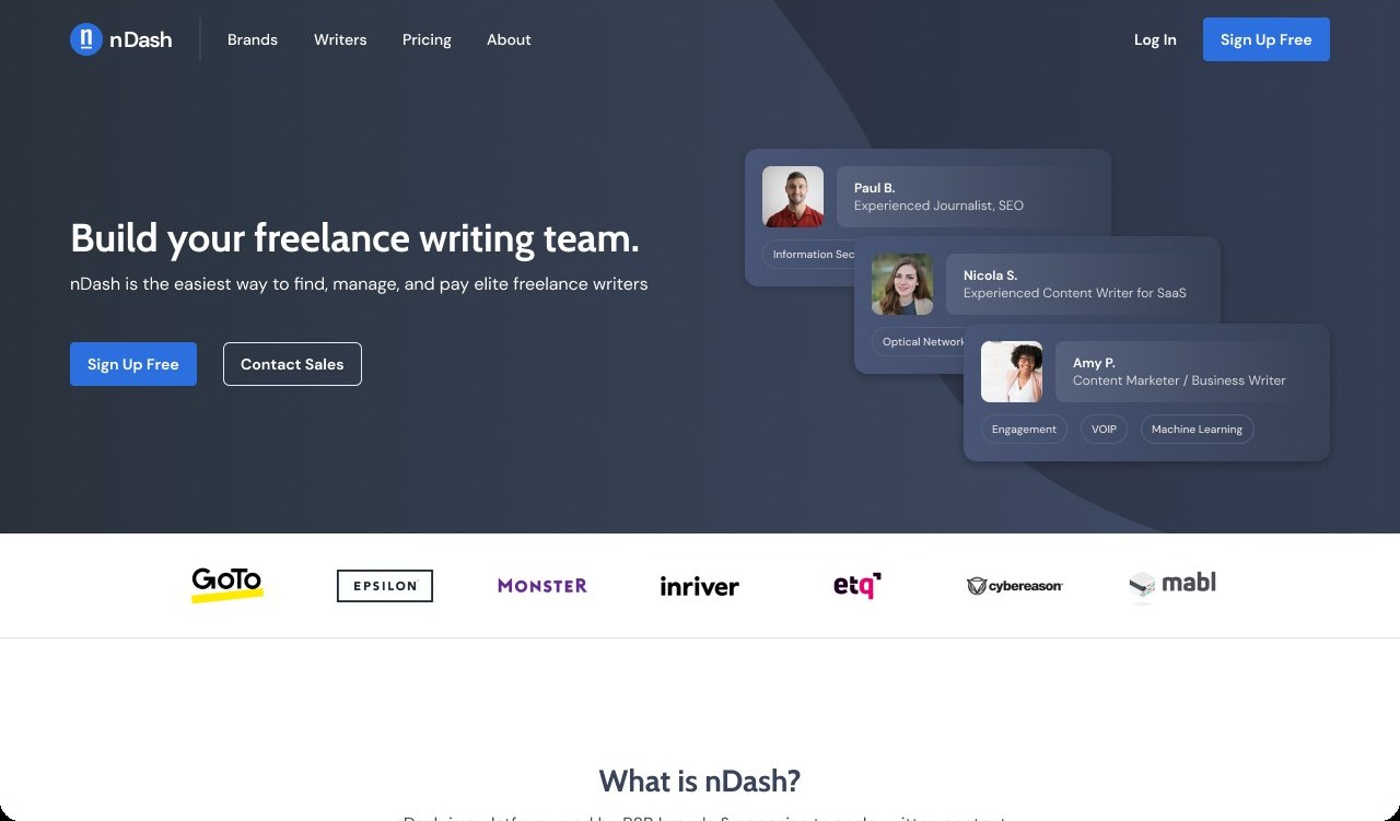
nDash connects freelance writers with the brands that need them, and it needed to look as professional as its writers. As a freelancer and the only designer, I refreshed the brand's color, type and interaction, redesigned the marketing website, then carried it all into the platform writers and clients use every day. The new site saw more engagement and a bump in platform users.
A capable product that looked like a template
nDash's marketing site had solid bones but felt dated and generic, and its brand-yellow buttons didn't meet accessibility contrast requirements. The platform itself felt disconnected from the brand, so the experience didn't read as one company.
From template to bold and confident
Here's what nDash looked like before I got my hands on it, the directions we explored, and where we landed.
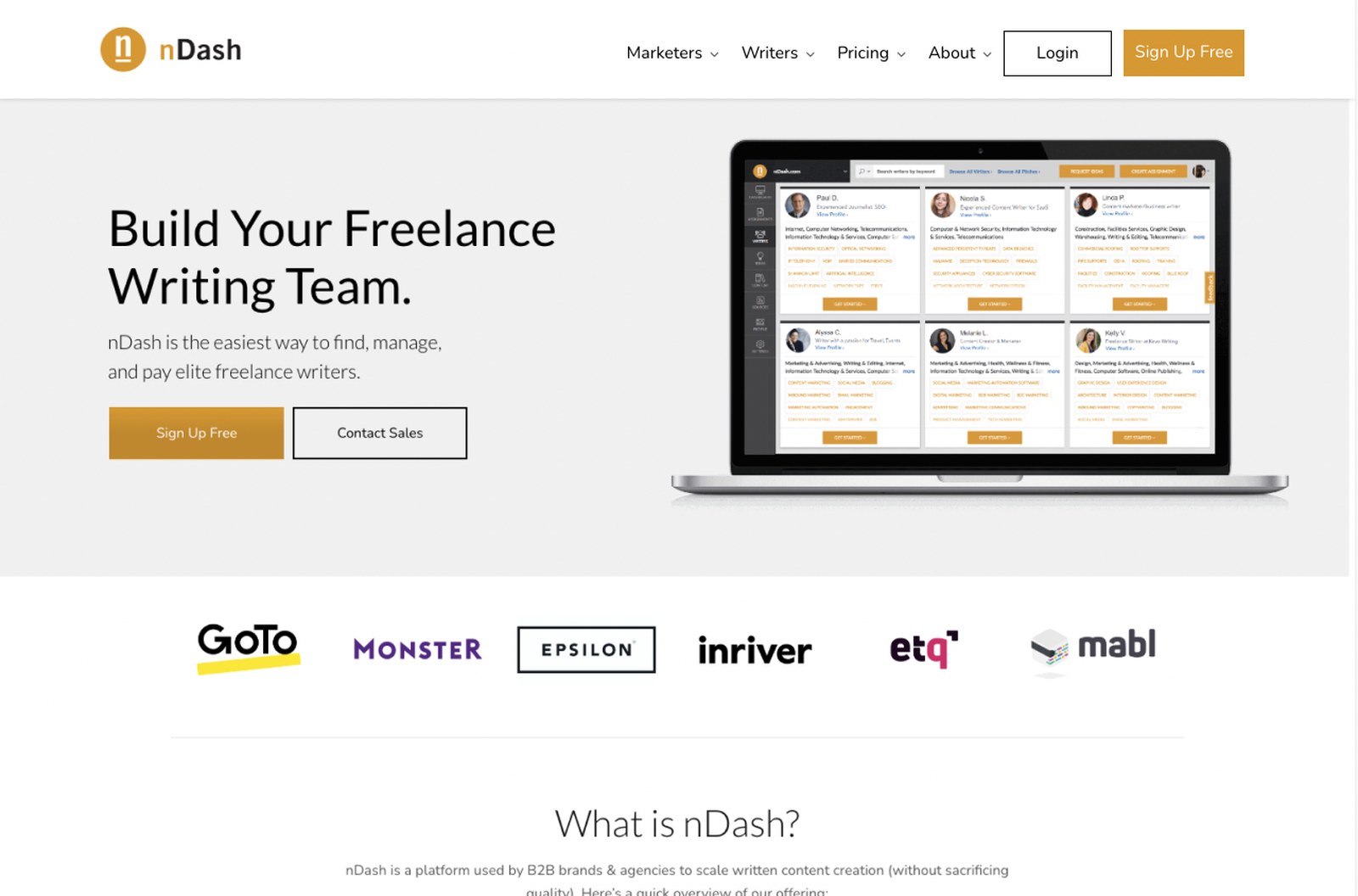
- +Solid bones: what nDash is, the tools, pricing, problems solved and clients.
- +Real client logos as social proof.
- –Muted orange and beige felt dated and generic.
- –White text on the brand-yellow buttons failed WCAG color-contrast requirements.
- –Weak hierarchy: everything carried the same visual weight.
- –Small, dense product screenshots undersold the platform.
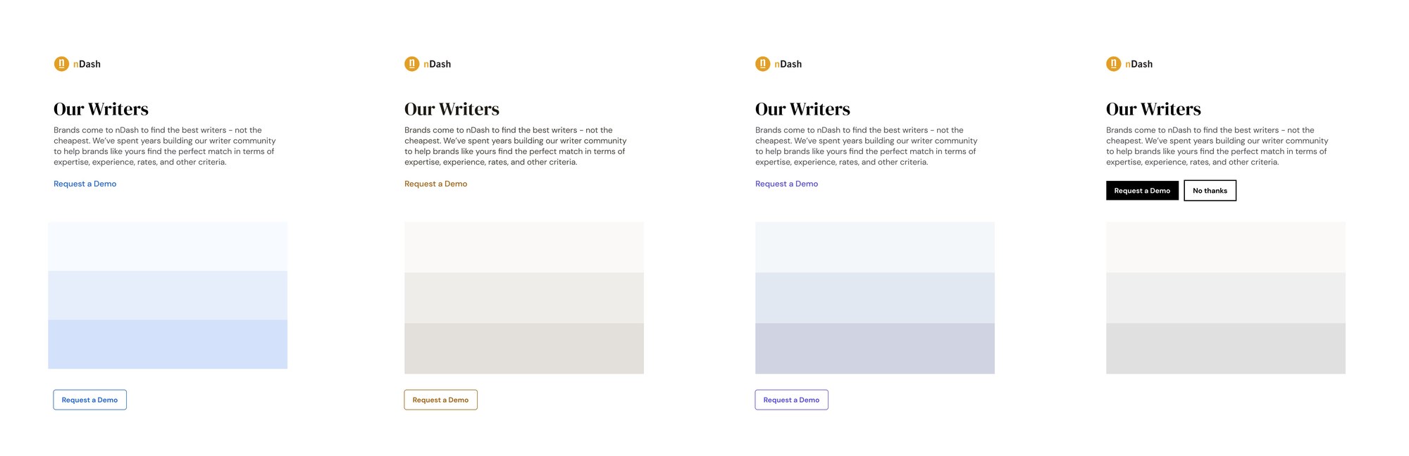
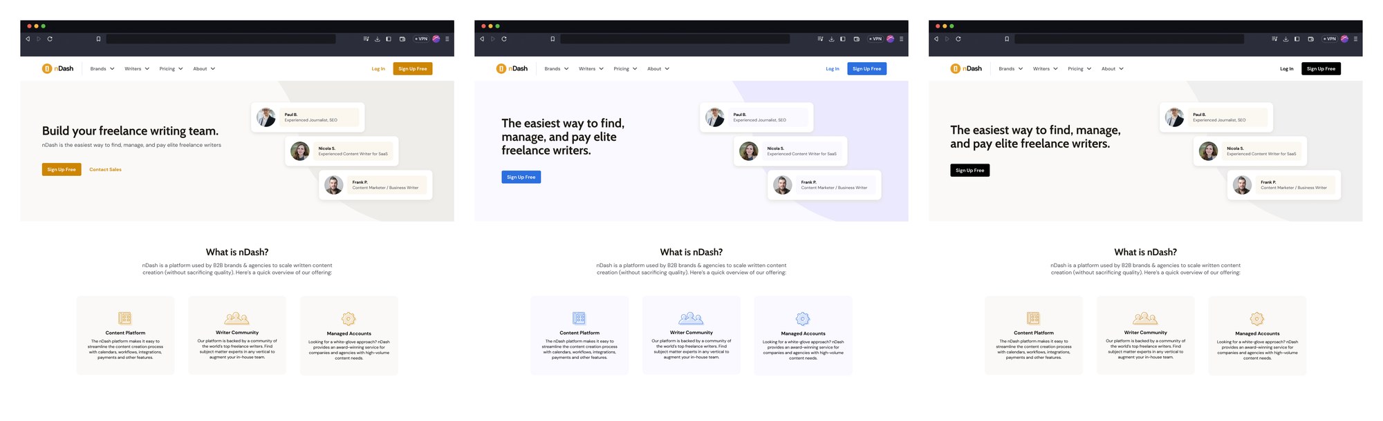
- →Four palette routes, from a bright blue to warm tan, periwinkle and a stark black.
- →Applied the strongest to the new homepage layout to see them in context.
- !The client chose the blue route and asked for bold splashes of deep navy.
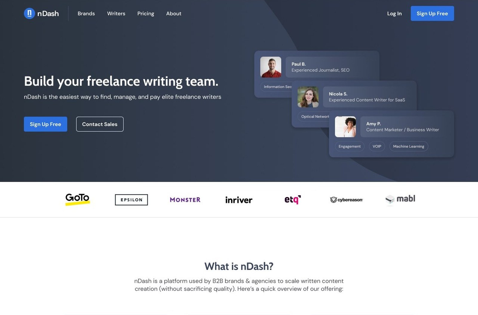
- +Deep slate and navy ground the brand, with warm orange as an accent.
- +Buttons moved off brand yellow to Interactive Blue, which meets accessible contrast for every call to action.
- +Cabin Bold headlines with clear hierarchy.
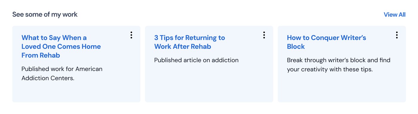
- +Real writer profiles lead, so the product sells itself.
Bringing the product up to the brand
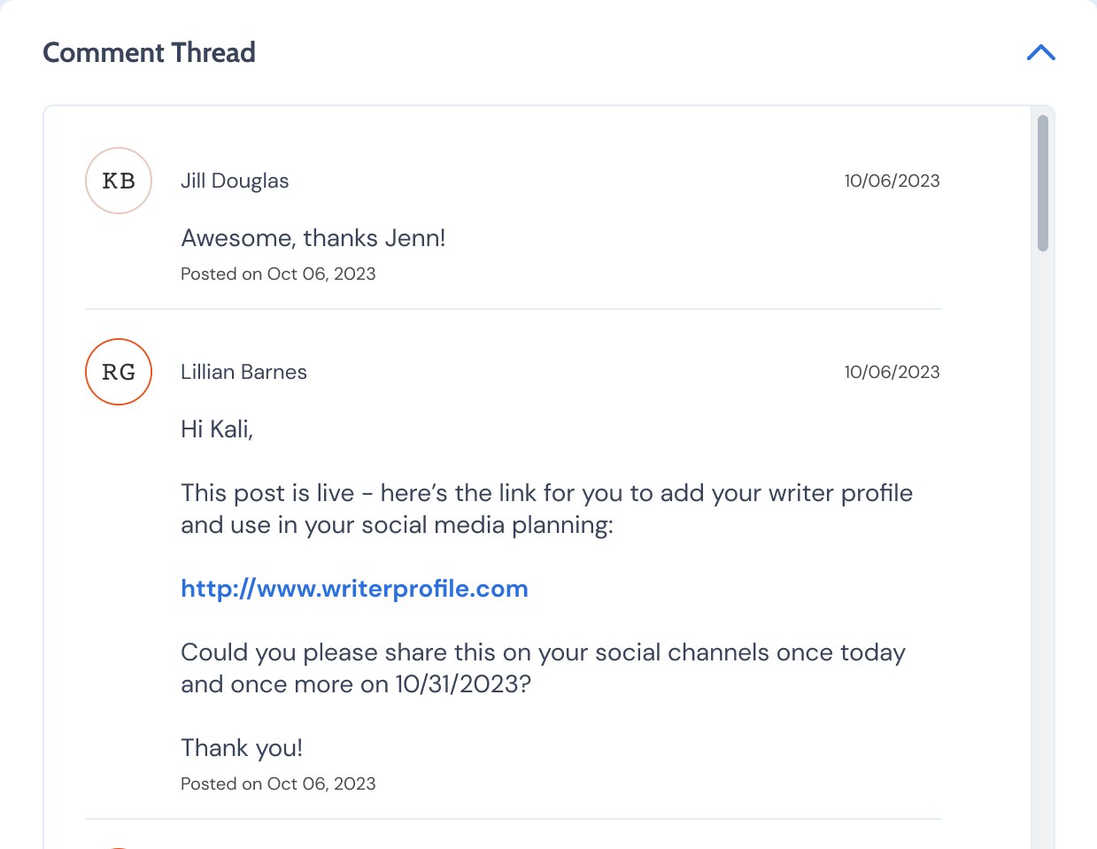
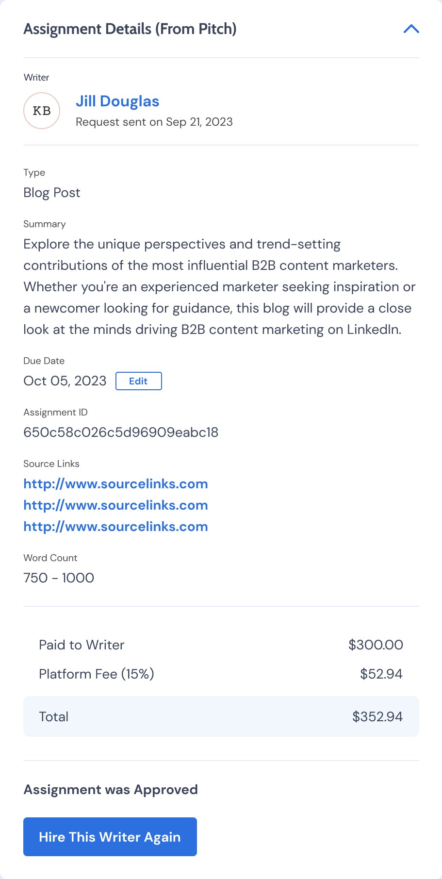
After the website, I redesigned key screens of the platform that writers and clients use every day. The goal was twofold: carry the new brand into the product so the experience felt like one company, and make the UI more useful for both sides of the marketplace.
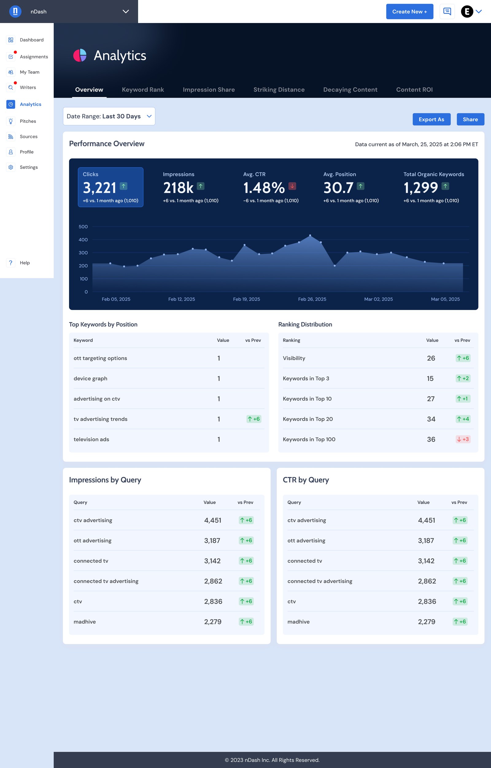
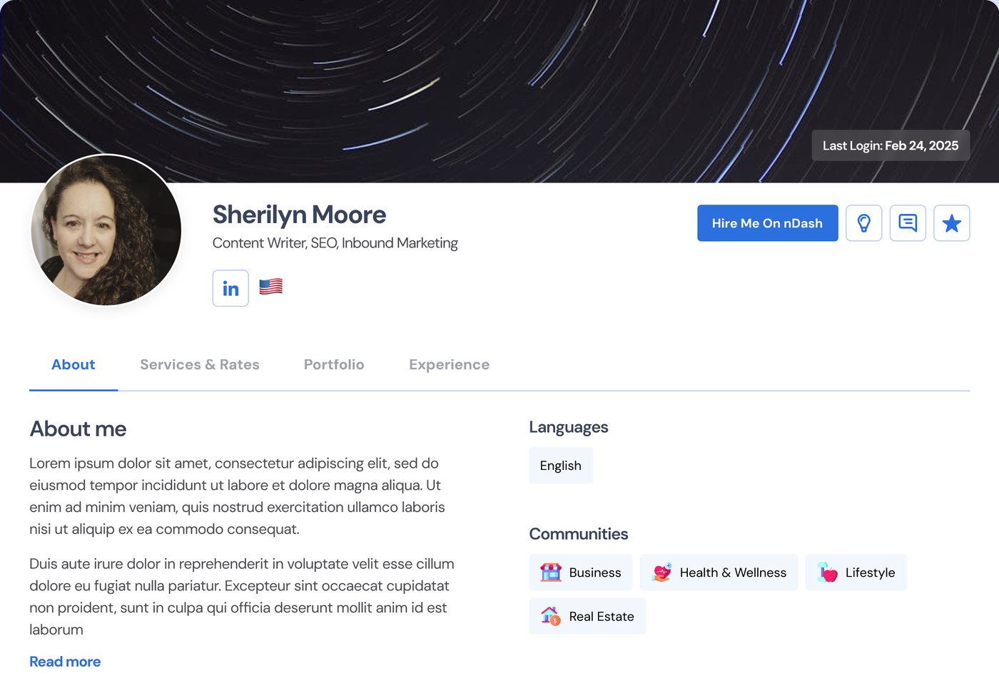
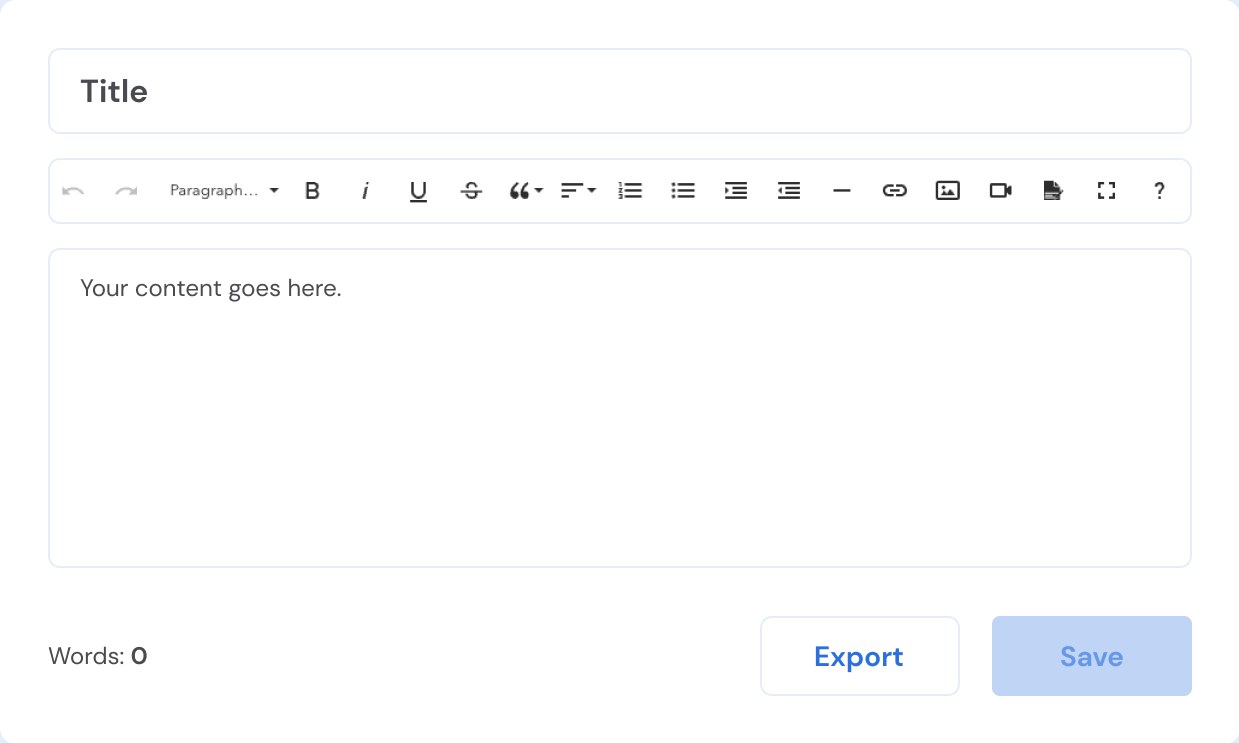
Writers first, then tools, then price
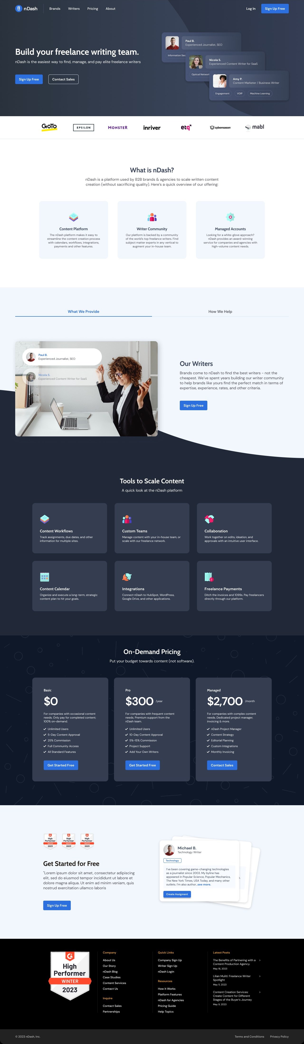
Real writer profiles and client logos lead, followed by the platform in three cards, then tools and on-demand pricing in the dark brand slate.
One system, tailored to each buyer
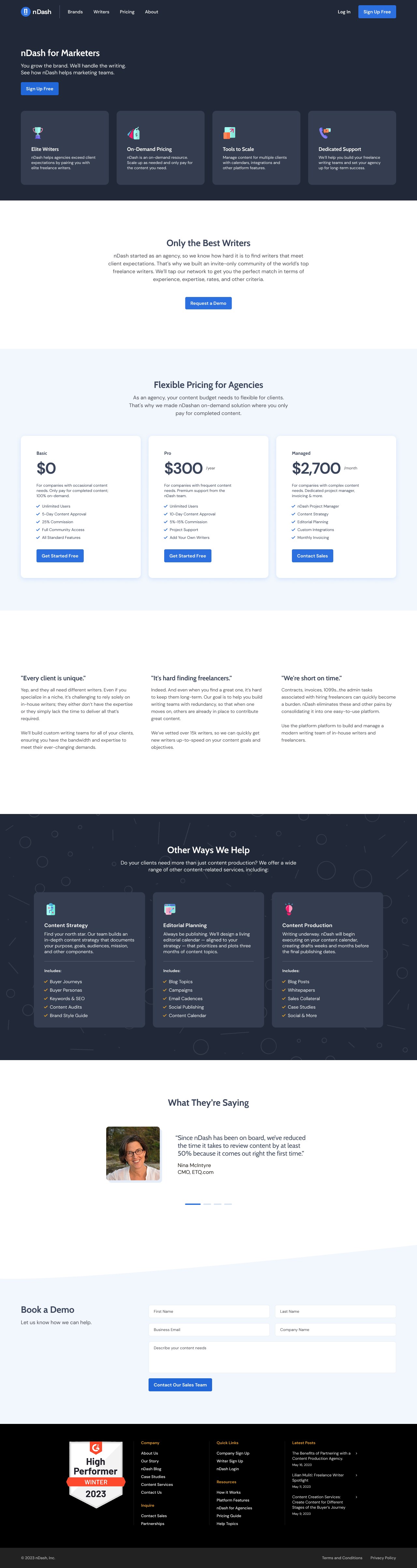
The marketers page reuses the same feature cards, pricing tiers, testimonials and demo form, with messaging built around agency pain points.
The outcome
The redesigned marketing site saw increased engagement.
More writers and clients signed up after the relaunch.
Platform users reported the updated tool felt more intuitive and easier to navigate.
Moving buttons from brand yellow to Interactive Blue fixed their contrast.
Working solo with the owners taught me to make decisions visible. Showing options side by side got us to a yes faster than any single polished comp.