
Support for Alzheimer's caregivers
Elevmi is a companion app for people caring for a loved one with Alzheimer's. As the sole designer, working directly with a Creative Director, I created the logo and defined the color palette and design language. When a partner agency built the final screens on its own design system, I reviewed every round to keep the product true to the client's vision.
A brand for people who are running on empty
Caregivers are exhausted and uncertain, and most health tools feel clinical. Elevmi needed a look and feel that was calm, warm and supportive from the very first touch.
Three directions, one blended answer
I explored three brand directions. The final identity took the best of two of them.
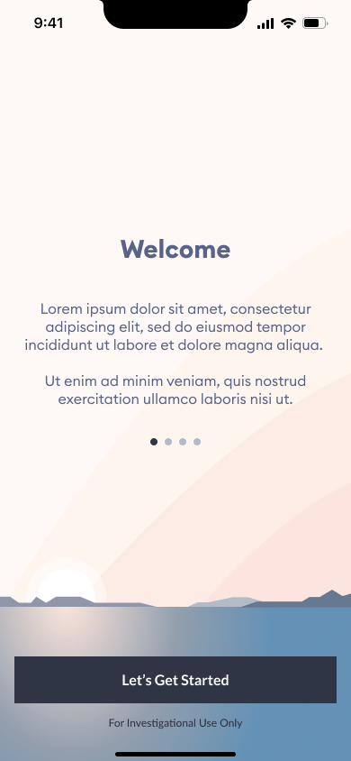

- +Soft gradients and sky-and-water imagery felt instantly calming.
- +Peach and dusk-blue variants gave it range.
- –Calm, but generic. Nothing in it said caregiving or connection.
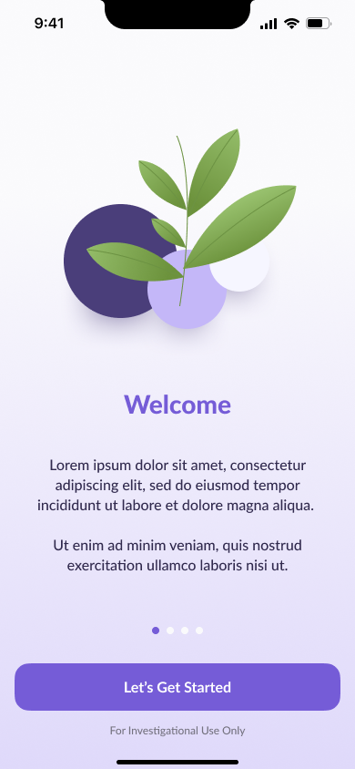

- +A purple palette with bright pops of green. The client loved it.
- –Plants and organic life told a story about growth, not about caring for someone.
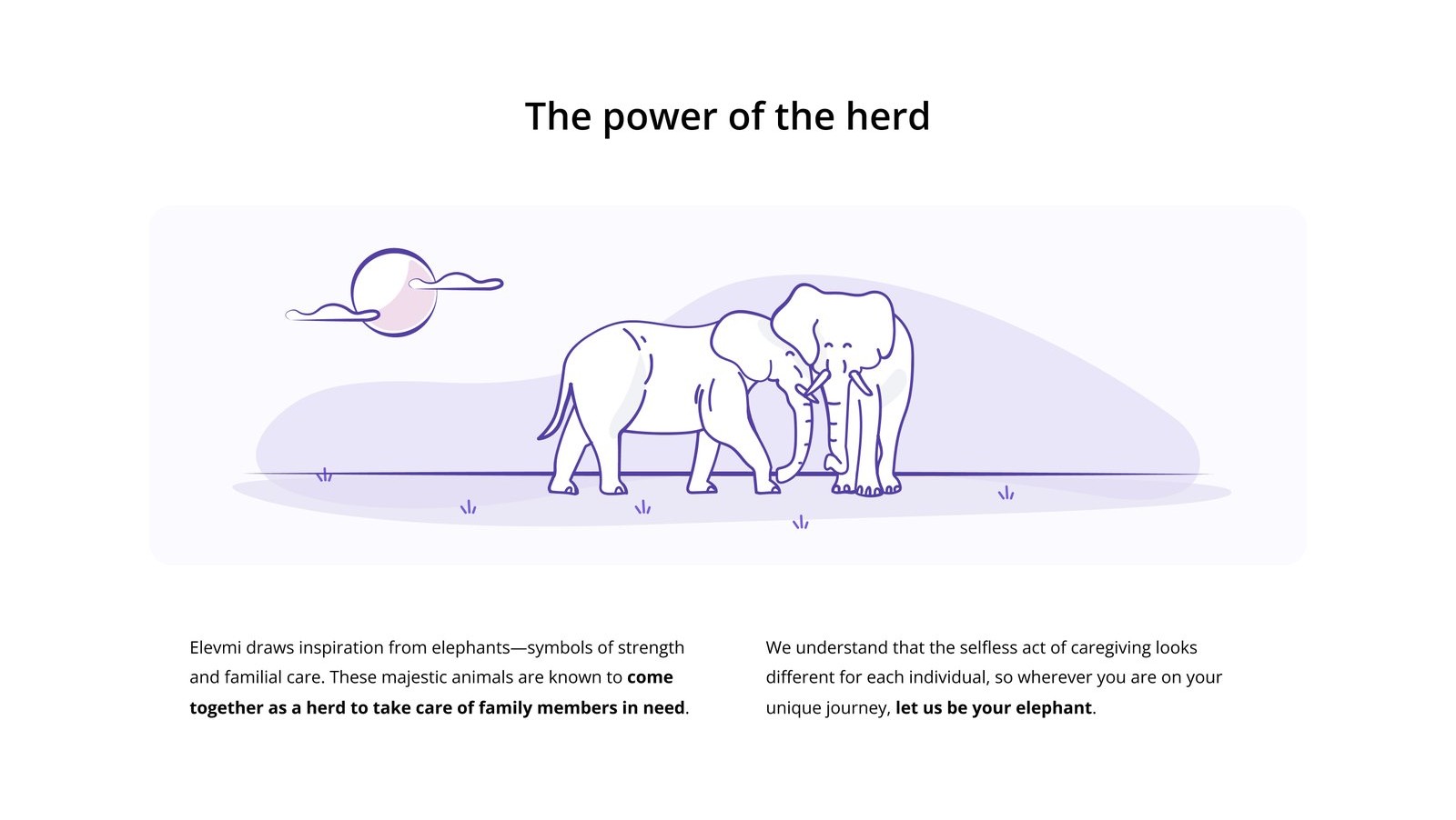
- +Elephants are one of the few animals that care for their elders. The client was hooked.
- –Elephants plastered everywhere would feel literal and childish.
So the story is told with restraint: a tusk-inspired logo, the herd saved for one key moment on the site, all in the organic palette.
A logo that hints instead of shouts
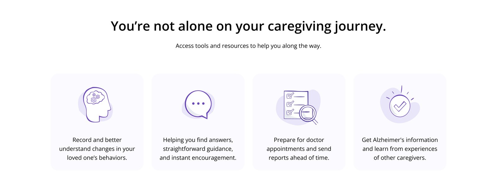
Elephants, symbols of strength and family care, became the core idea: "let us be your elephant." I spent about a week iterating on the logo. Rather than covering everything in elephants, I kept the reference subtle: the mark takes its shape from tusks, and a hand-lettered wordmark keeps it personal, never clinical. The palette and design language were locked in alongside it.

Protecting the vision through someone else's system
The client brought in a partner agency with a plug-and-play design system: hand over the colors, type and styles, and it produces comps fast. Speed was the upside. The risk was a product that technically used the brand but lost its warmth.
So I stayed on as the brand's guardian, reviewing each set of screens the agency produced and giving feedback on color, type, imagery and tone until the final product held up to the original vision.
Help in the moment, in your pocket
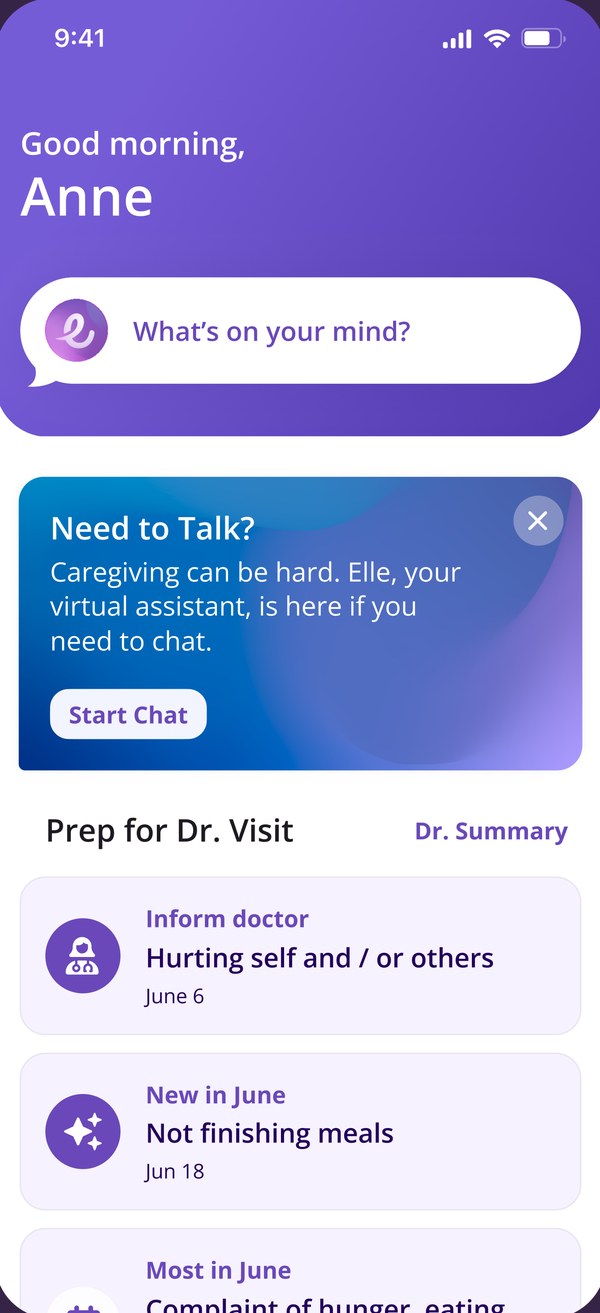
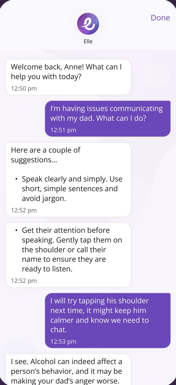
A home screen that greets you by name, Elle the virtual assistant for hard moments, and a mobile sign-up that carries the brand from the first touch. Final screens were built by the partner agency using the brand I defined, refined through my reviews.

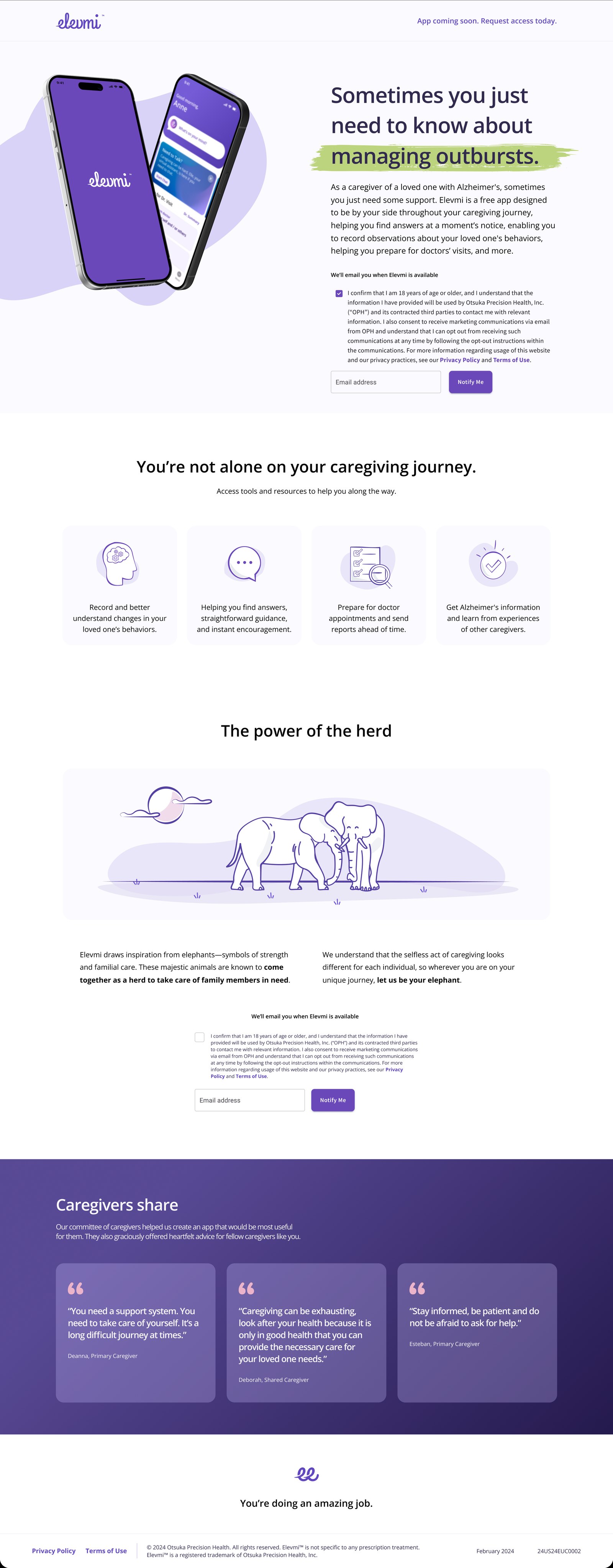
The brand system, extended online
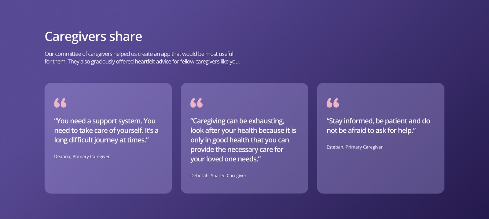
The pre-launch site tells the story top to bottom, shares advice from real caregivers, and collects early-access sign-ups. Scroll the laptop at the top to see the full page.
The outcome
Logo, palette and design language, defined in partnership with the Creative Director and adopted by the client.
The look and feel carried through the partner agency's system into the final app, kept on track by my design reviews.
A brand only matters if it survives handoff. Being clear about the why behind each choice made it far easier to give the partner agency useful feedback, not just "make it feel more like us."