
Briefing doctors before they walk into the room
The platform pairs medication with a wearable sensor that detects when it's taken. Over two years, I led design first on the patient app's onboarding, then on the web portal doctors use to review patient data. Patients engaged more, doctors reported more productive appointments, and my final dashboard concept was unanimously voted more useful by doctors in testing.
Two audiences, two hard problems
Patients start with onboarding, which includes pairing a Bluetooth sensor patch. That flow had to be tested in FDA-regulated sessions, long before any working build or hardware existed.
Doctors often have only a few minutes between appointments. The portal I inherited showed everything (medication, mood, steps and rest) as near-identical red-and-green charts, leaving them to piece the story together chart by chart.
How do you test Bluetooth pairing with no hardware?
Patient onboarding hinged on pairing a Bluetooth sensor patch worn on the abdomen. That moment needed testing with real users in a regulated environment, but there was no working build and no budget to wait for one. So I taught myself ProtoPie and built the whole onboarding prototype on my own.
The key was a two-device setup. The moderator triggered events on the participant's phone, like the patch being detected, pairing and confirmation, so the experience felt real without any hardware. The finished prototype met FDA standards for use in a test environment.
Making a dense doctor dashboard readable at a glance
Once the prototype shipped, I moved to the doctor portal. I didn't get there in one leap: each version fixed the biggest problem with the last, and taught me what to fix next.
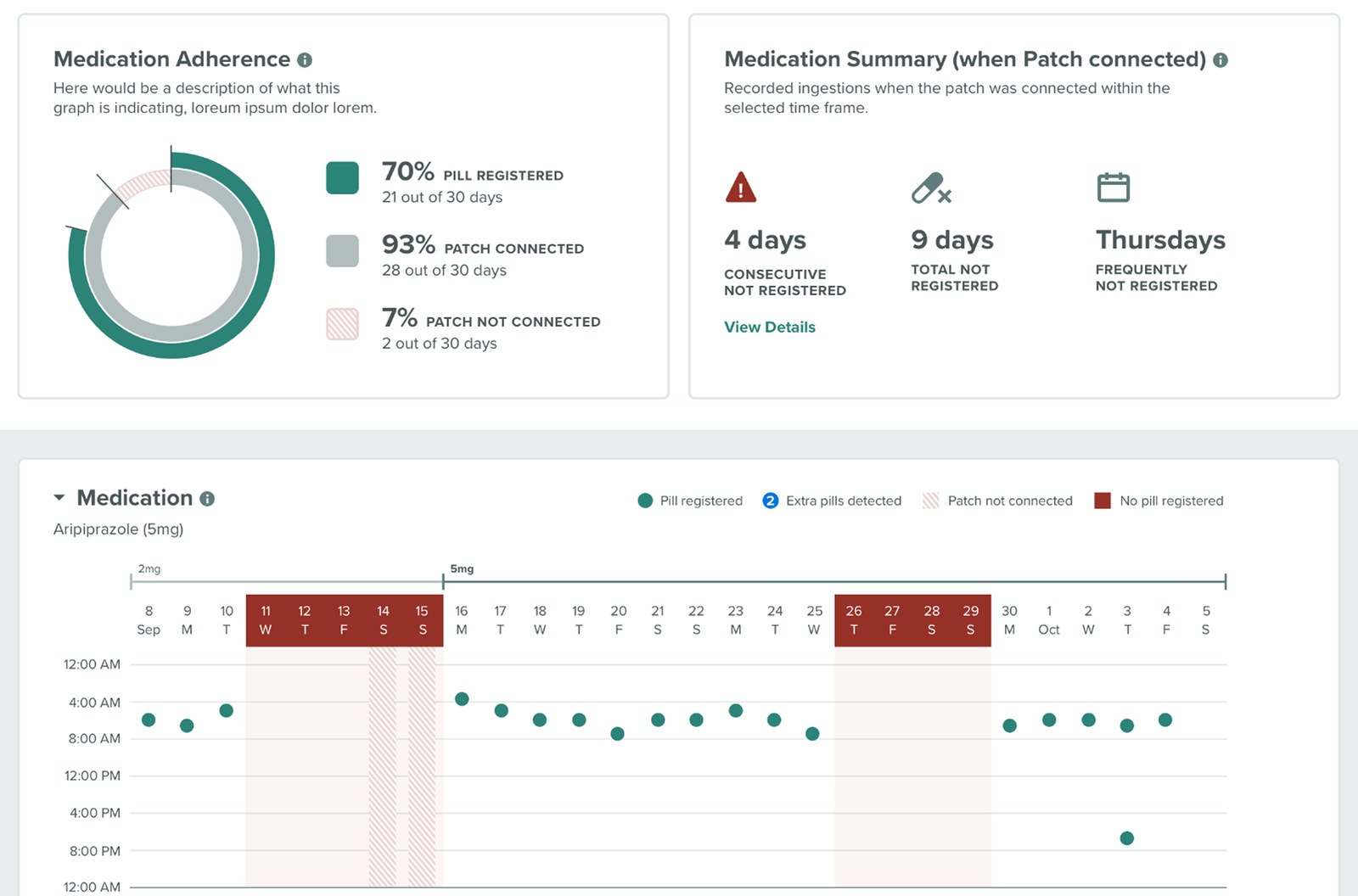
- +Everything was there: medication, mood, steps and rest on one shared timeline.
- +Missed days were impossible to miss.
- –Heavy green and red made everything feel urgent, so nothing stood out.
- –Near-identical charts stacked one after another.
- –Doctors had to piece the story together chart by chart.
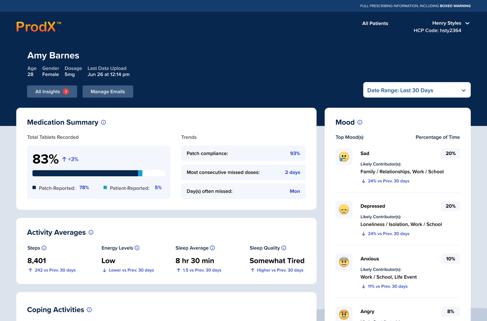
- +Modern visuals and a calmer palette.
- +Information grouped by meaning: medication summary, activity averages, coping and mood.
- +Mood now shows its likely contributors.
- +Each chart got smaller clarity fixes.
- –The answer still wasn't on the page. Doctors were left to read every section and draw their own conclusions.
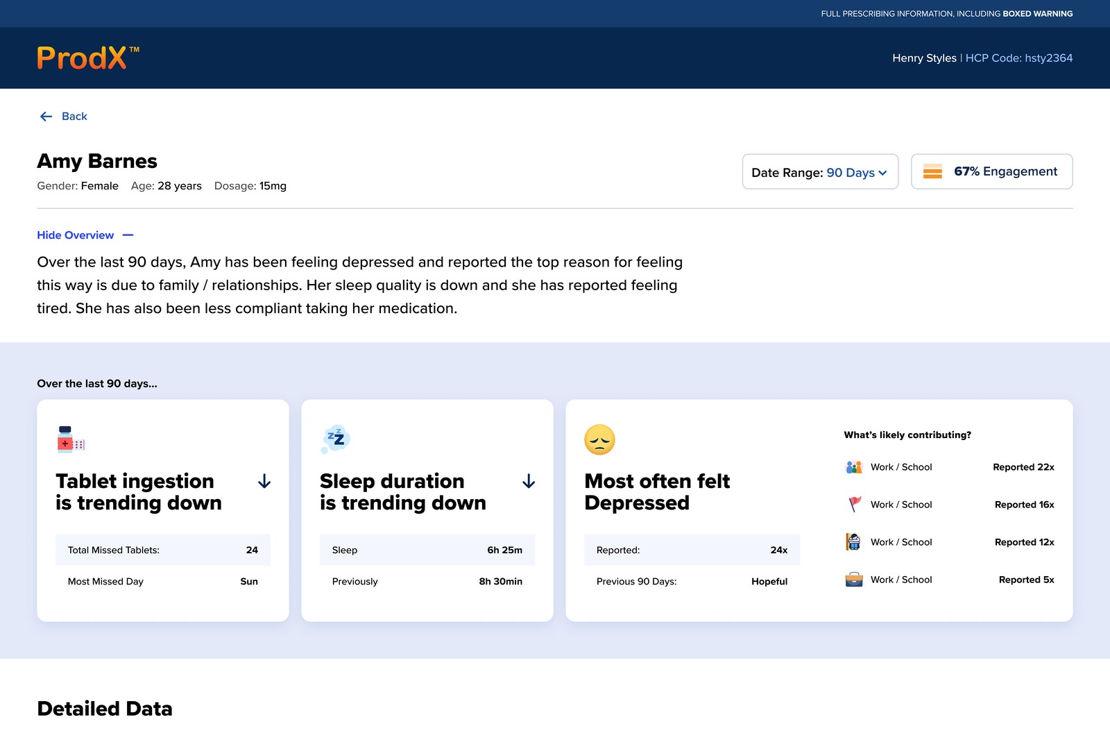
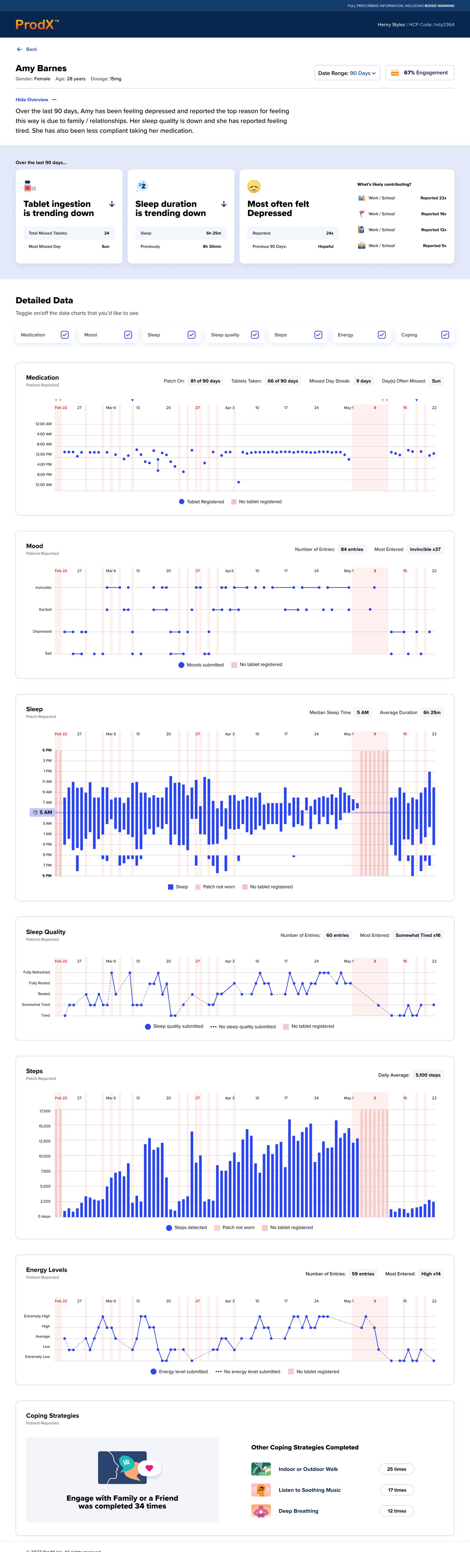
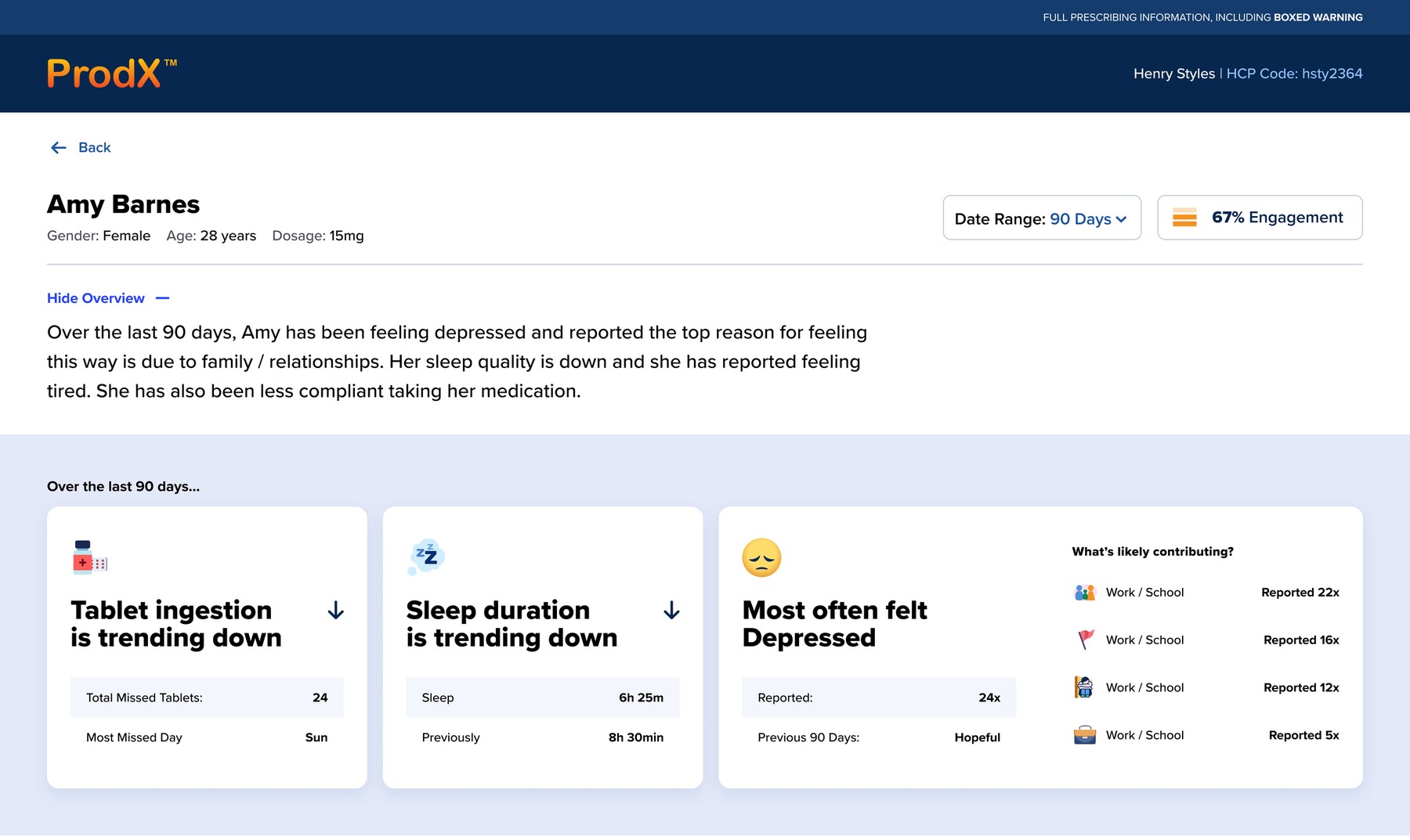
A plain-language summary tells the doctor how the patient is doing. Insight cards flag the trends and the likely why, and the detailed charts sit below for anyone who wants to dig in.
How is this patient doing? Answered at the top.
A plain-language overview sums up the period in a few sentences. Below it, three insight cards flag what matters: whether medication and sleep are trending up or down, the mood reported most often, and what's likely contributing. A doctor can walk into the room already knowing what to ask.
The evidence, when they want it
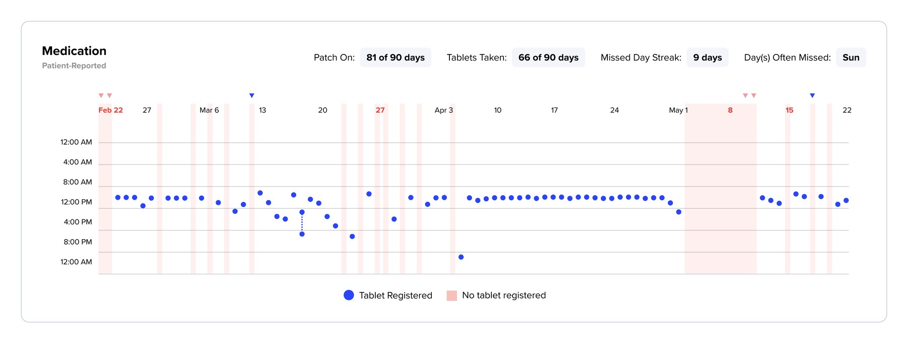
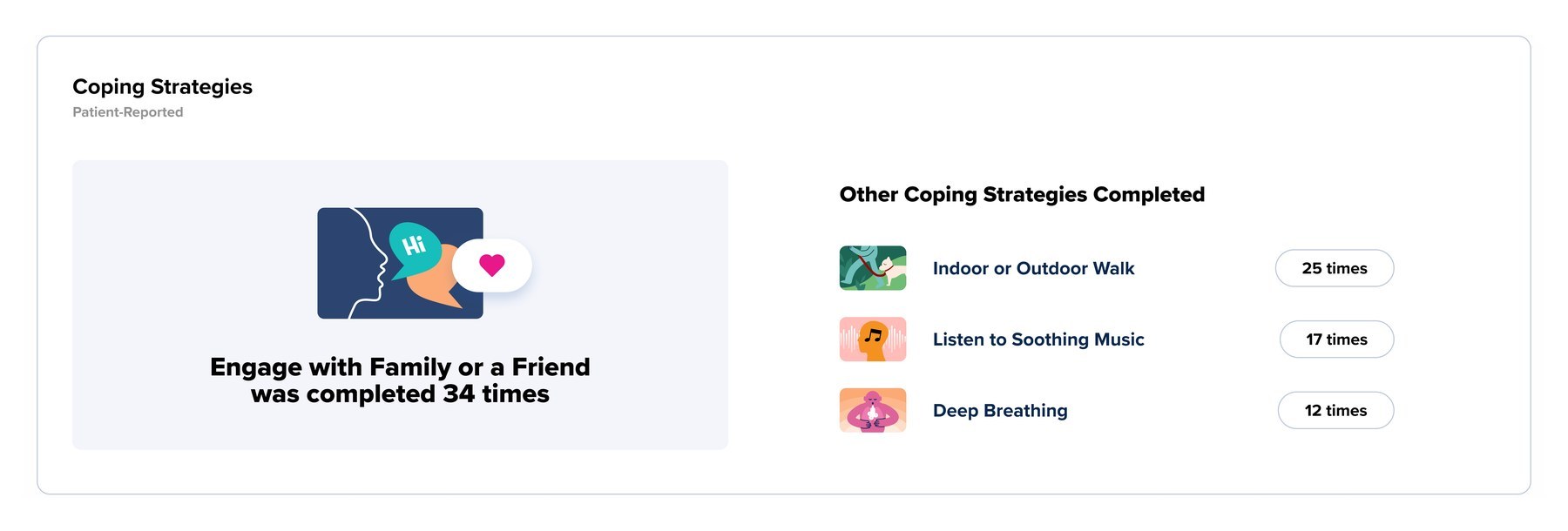
Below the summary, doctors can toggle each data set on or off to focus on what matters for this patient: medication, mood, sleep, sleep quality, steps, energy and coping. Every chart shares one timeline and one set of markers for missed doses, so patterns line up across signals.

Small moments that keep patients on track
The data doctors see comes from patients checking in, so check-ins had to feel rewarding: a celebration when one is complete, a sun that rises as you say how rested you feel, and a mood line that shows how life shapes the week.
The outcome
In testing, doctors unanimously voted the future dashboard concept more useful than the earlier versions.
Doctors reported a noticeable increase in productivity and impact, with the right information at a glance to guide more meaningful conversations.
Patient engagement within the app increased over the course of the engagement.
My ProtoPie prototype met FDA standards and was used in regulated testing sessions.
Density was never the real problem; missing hierarchy was. The biggest wins came from deciding what a doctor needs first and letting everything else become supporting evidence.